

Why Bonna Has Become a Favourite for Contemporary Table Presentation
The most popular advice about restaurant crockery is often the least useful: choose the plate that looks most impressive on the shelf. In practice, the best plate isn't the one that looks best empty. It's the one that makes the food look best when it's full, while still surviving storage, service, washing and replacement cycles.
That balance explains why Bonna has become a favourite for contemporary table presentation. Its organic shapes, textured finishes, distinctive colours and vitrified porcelain construction give chefs room to style food with intention, while its commercial design addresses the less glamorous realities of hospitality. The right selection depends on the menu, portion sizes, venue concept, warewashing setup and the availability of replacement pieces.
The Best Plate Isn't the One That Looks Best Empty
A plate can look beautiful in a catalogue and still work poorly on a busy pass. An unusual rim may crowd a carefully arranged dish, a deep bowl may hide a low-profile portion, or a dramatic glaze may compete with food that already relies on colour and texture. The decision needs to begin with the plated menu, not the empty crockery rack.
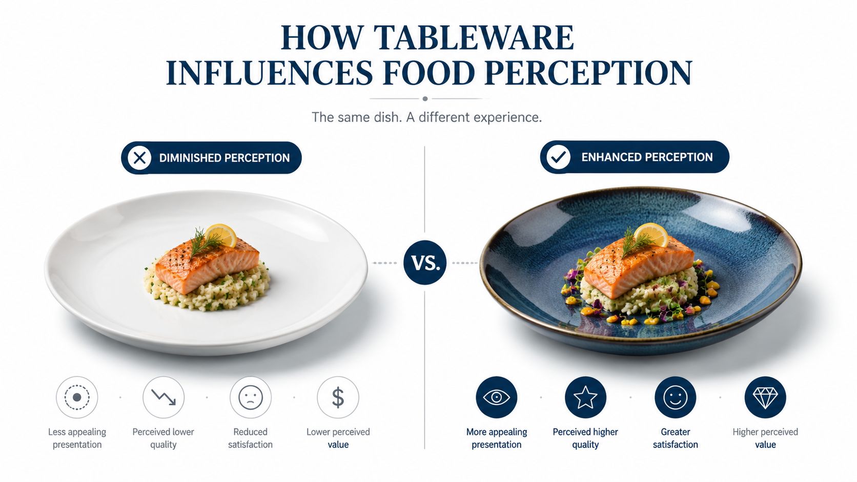
Tableware influences the dining experience before a guest takes the first bite. Shape controls the visual space around a portion. Colour affects contrast. Texture can either frame a dish or make a delicate sauce look untidy. Size changes the perceived relationship between the food and the table, particularly when chefs use generous negative space or serve mains directly in shallow dishes.
New Zealand tableware guidance reflects this move towards food-first presentation, muted tones, natural materials, handcrafted finishes and less cluttered settings. The NZ crockery selection guide is useful for operators comparing presentation needs with commercial requirements, rather than selecting pieces on appearance alone.
A broader dining-room perspective can also help operators think about how crockery relates to the whole setting. The Willis Furniture & Mattress decor guide considers the accessories around a dining table, which is relevant when plates, glassware, cutlery, lighting and furniture need to feel like one organised experience.
Practical rule: Test every shortlisted plate with representative food, not an empty table.
A tasting plate, a sauced main, a shared side and a dessert will reveal more than a product photograph. The operator can see whether portions sit comfortably, whether sauces spread where expected and whether staff can carry, clear and stack the pieces without awkward handling.
Bonna suits this decision-making process because the range gives venues more than one visual direction. Classic white supports precise presentation, while coloured glazes, natural tones and organic forms can make the crockery part of the restaurant's identity. The strongest result comes when the plate supports the food, rather than asking the food to adapt to the plate.
How Tableware Influences Food Perception
Plate selection affects how diners read a dish. A pale portion can appear more defined against a dark surface, while a highly coloured dish may need a quieter background. Shape and texture also guide the eye, creating a visual boundary around food or softening the formality of the setting.
The same seasonal dish can take on different character depending on its crockery:
- Dark tableware: A bright salad, pale fish or colourful vegetables can gain contrast against a darker glaze. This approach can make ingredients appear more pronounced, but it can also expose stray marks, crumbs or sauce smears.
- Earthy and natural finishes: Root vegetables, grains, roasted produce and rustic dishes often sit comfortably with natural tones and tactile surfaces. The risk is visual flattening if both the food and plate occupy similar muted colours.
- Organic shapes: Irregular outlines can support contemporary plating that feels relaxed rather than formal. They work particularly well when the composition is intentionally asymmetrical, although inconsistent plating can look accidental on a strongly shaped piece.
- Classic white: White gives chefs a neutral field for intricate arrangements, bright sauces and fine detail. It remains a dependable choice when the food should dominate, though a plain setting may provide less visual distinction for a venue seeking a stronger signature.
Size matters just as much as colour. A large shallow plate can give a main course room to breathe and can support shared service at the table, while a smaller vessel may be better for a sauce, garnish, tasting element or side dish. The correct scale depends on portion size, plating height, sauce volume and the restaurant's menu positioning.
The wider presentation system
A plate doesn't work in isolation. Glassware, cutlery, linen, table spacing and even the visibility of chilled product contribute to the perceived experience. The discussion around premium glassware and its value is relevant because operators need to judge every front-of-house item as part of the overall service, not as a disconnected purchase.
Presentation also extends into display and storage decisions. For example, the SKOPE ActiveCore 2 Door Display Freezer - Black - SKFT1000N-A combines a removable refrigeration platform with a black cabinet, two glass swing doors, adjustable shelving and interior LED lighting. Its stated operating range is -21°C to -18°C, adjustable from -26°C to -12°C, with a cabinet rated for ambient temperatures up to 40°C, according to the supplied product information. The example illustrates the same principle: commercial equipment must present products clearly while continuing to perform its operational job.
Bonna's Design Language and Contemporary NZ Trends
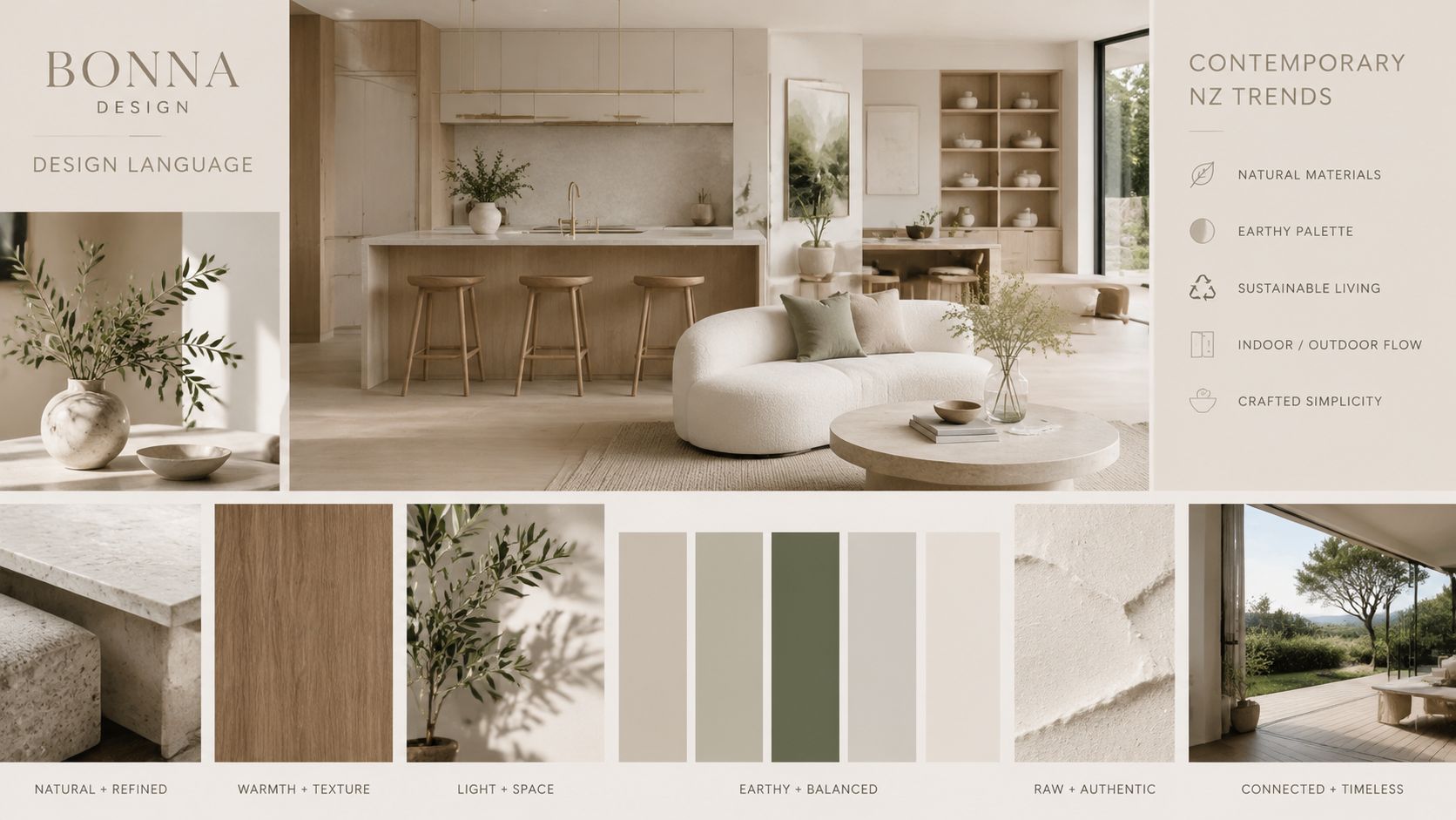
Bonna's appeal comes from giving chefs several ways to create a contemporary table without making every setting feel decorative. Organic shapes, textured finishes, earthy tones, coloured glazes and traditional white options can sit within one considered tableware strategy, allowing a venue to match crockery to food and concept.
That flexibility aligns with New Zealand hospitality presentation trends. A 2023 ArchiPro feature identified muted tones, natural materials, handcrafted finishes and organic forms as leading preferences, while simple white-on-white dinnerware remained a constant choice among quality operators. The same coverage described a shift towards less cluttered tables and the use of large shallow dishes for mains served directly at the table, helping ingredients remain the visual focus. (ArchiPro's NZ tableware trends feature)
Why restraint works
Contemporary design doesn't mean every item needs a dramatic glaze or irregular edge. A natural finish may suit a produce-led menu, while white porcelain may better frame highly detailed food. Coloured accessories can introduce variation without forcing the venue to replace every piece in the collection.
A broad collection becomes practical. Operators can use larger plates for mains, coupe shapes for relaxed presentation, bowls for broths or grains, platters for shared service and small dishes for sauces and tasting components. The goal isn't visual variety for its own sake. It's a coherent set of choices that gives the kitchen room to express the menu.
New Zealand's market context supports that interest in commercially oriented presentation. MBIE tracks aggregated hospitality sales across Aotearoa by geography, subsector and channel, giving operators a national and regional framework for understanding foodservice demand. A 6W Research summary reported 3.21% compound annual growth in the New Zealand tableware market from 2020 to 2024, alongside an 8.86% increase from 2023 to 2024, with restaurant use identified as a major commercial segment. (MBIE hospitality sales data)
The broader design direction is also covered in NZ hospitality trends for 2025. For operators, the useful takeaway is simple: contemporary tableware needs to look intentional without adding unnecessary clutter, handling difficulty or wash-up.
Commercial Practicality Meets Contemporary Design
A premium-looking plate still has to work through a commercial dishwashing process, move safely from storage to the pass and remain available when a piece is lost. Bonna is positioned around that combination of presentation and service practicality, rather than appearance alone.
NZ hospitality supply documentation describes Bonna as vitrified porcelain made through a two-firing vitrification process, with a scratch-resistant finish and dishwasher, microwave and oven safety. Vitrification reduces porosity and supports thermal stability, both relevant to repeated commercial handling. The same documentation presents the range as suitable for busy commercial eateries, with a balance of durability, stackability and lightness. (Bonna vitrified porcelain product information)
What operators need to check
A crockery decision should include the whole ownership cycle:
- Stackability: Pieces need to fit the available shelving and racks without unstable piles or wasted vertical space.
- Warewashing: The shape should sit securely in the venue's dishwashing racks, with enough separation to reduce contact during cleaning.
- Handling: Staff need to carry and clear the pieces confidently, particularly during busy service.
- Replacement: Individual plates, bowls and small dishes should be available through an established range rather than only as a short-lived style.
- Range continuity: A venue may start with a single plate and later need matching bowls, platters or side pieces.
- Storage: The back-of-house layout must accommodate the chosen shapes without creating bottlenecks around the wash-up area.
The Bonna Lunar White Plate 220mm demonstrates why a classic white option remains relevant. It can support food-led presentation where colour, precision and detail matter more than a strong decorative frame.
Protecting the investment
Commercial porcelain isn't indestructible. Correct storage, suitable dishwashing racks and sensible staff handling all influence how long crockery remains serviceable. Operators should also check that racks don't force rims together and that staff aren't stacking hot pieces in ways that create avoidable thermal stress.
Replacement frequency is only one part of total cost of ownership. The operator should also consider labour involved in sorting, storage space, wash-up flow, visual consistency when pieces are unavailable and the cost of changing a range before the venue has recovered its purchasing effort.
NZ commercial ceramic tableware is covered by AS/NZS 4371:1996, which sets performance and marking requirements and maximum lead and cadmium release limits. (AS/NZS 4371:1996 from Standards New Zealand) That compliance baseline matters when operators assess food-contact suitability alongside design.
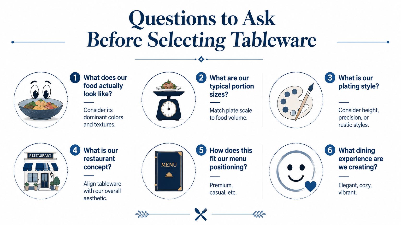
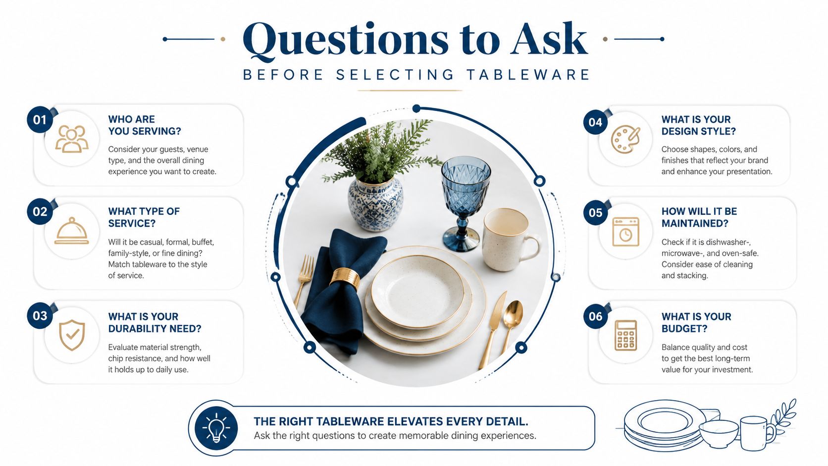
Questions to Ask Before Selecting Tableware
A good tableware decision starts with the menu and ends with the stockroom. The following questions help prevent impulse purchases based on catalogue appeal.
What does the food actually look like?
Photograph representative dishes on shortlisted pieces under the venue's normal lighting. Check dominant colours, sauce density, garnish texture and the amount of empty space required around the portion. A dark plate may add contrast to pale ingredients, but a natural finish could better suit roasted produce or handmade pasta.
Which colours will complement it?
Look for repeated ingredients across the menu. If dishes already contain bright purples, greens, reds or yellows, neutral crockery may create a calmer frame. If the food is pale or restrained, a deeper glaze can provide definition without requiring extra garnish.
Does the plate suit the portion size?
A plate that is too large can make a generous portion appear sparse. One that is too small can make an organised composition look crowded and can leave sauces close to the rim. Portion size should be tested at service volume, not only during a chef's final plating trial.
Does it reinforce the restaurant concept?
A relaxed café, a produce-led bistro, a formal dining room and a shared-plate venue may need different visual cues. Organic shapes can soften a less formal service, while clean white pieces can reinforce precision and restraint.
Can it withstand commercial service?
Assess the rim, underside, stacking profile and compatibility with existing warewashing racks. Ask staff to carry, clear and stack sample pieces, because a plate that works for the chef may be uncomfortable for the floor team.
Can individual pieces be replaced?
A complete range needs continuity. Before ordering, confirm whether the venue can replenish key plates, bowls, platters and sauce dishes without redesigning the table when one category becomes unavailable.
A useful test is to compare the same dish on conventional white crockery and a more distinctive Bonna piece. The answer isn't always the more decorated option. If the food looks clearer, more balanced and more desirable on white, that is the correct choice for that dish.
Matching Bonna Styles to Different Food and Concepts
A produce-focused venue may choose earthy and natural finishes because they sit comfortably beside seasonal vegetables, grains, roasted meats and rustic sauces. The plate becomes part of the ingredient story without adding a separate decorative layer. The operator still needs to check that similar tones don't make pale food disappear.
Darker pieces work differently. They can create contrast with bright vegetables, pale seafood, creamy sauces and colourful desserts. This can make a simple composition feel more defined, although dark finishes require disciplined wiping and careful checking under service lighting.
Organic shapes suit menus that favour asymmetry, shared plates and less formal presentation. A chef can place a composed salad or grilled dish slightly off-centre and allow the outline of the plate to support that relaxed approach. The result should look deliberate, not as though the food has been placed on an awkward surface.
Classic white remains the safer choice for intricate plating. Fine sauces, precise garnishes and layered textures are easier to assess against a neutral background, which is why many quality operators continue to use white-on-white dinnerware alongside more expressive pieces.
Smaller pieces with a clear job
Small dishes are useful when they have a defined service purpose. NZ Bonna product information describes a 90 mm dish as suitable for sauces and dips, with stackability and small-plate use built into the proposition. (Bonna Alhambra 90 mm dish information) A venue might use that format for aioli, chilli oil, condiments, tasting portions or a garnish served separately from the main plate.
The Bonna Luca Mosaic Plate 320mm shows the other end of the scale, where a larger surface can support a main course, shared presentation or a composition that needs generous visual space. The choice should follow the menu rather than the piece's appearance in isolation.
Design references outside hospitality can also help when a venue is developing a floral, natural or textural visual direction. The Fiore flower collections provide useful inspiration for colour relationships and organic forms, although commercial crockery still needs to be assessed for stacking, washing and replacement before it reaches service.
The most effective Bonna selection often combines styles carefully. A venue might use white for intricate mains, earthy finishes for seasonal specials and small matching dishes for sauces, keeping the table organised without making every course visually identical.
Making Informed Tableware Decisions for Your Venue
Contemporary presentation works when design and service resilience support each other. Bonna has become a favourite because its organic forms, colours, finishes and white options give chefs flexibility, while vitrified porcelain and practical range features address the demands of commercial hospitality.
The decision still belongs to the menu. Operators should test food colour, portion scale, plating style, concept alignment, warewashing, storage and replacement availability before committing. A striking plate that increases wash-up difficulty, breakage risk or stock complexity may not create a better overall experience.
Food prices and operating costs remain under pressure. NZ food price inflation was 4.6% year-on-year to June 2025, compared with 2.7% general inflation, while restaurant meals and ready-to-eat food were rising 2.0% in May 2025, according to the supplied NZ hospitality coverage. (Hospitality Business coverage of tableware and plastic waste) That makes disciplined purchasing more important than choosing crockery for visual impact alone.
Simply Hospitality can help restaurants, cafés, caterers and accommodation venues compare crockery, glassware and warewashing requirements around their menu and service model. Visit Simply Hospitality to review suitable tableware options and contact the team for practical guidance on building a cohesive, commercially workable presentation system.